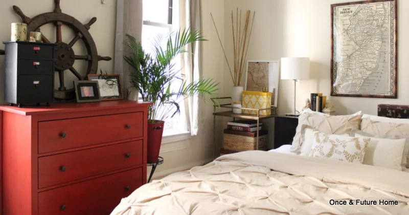
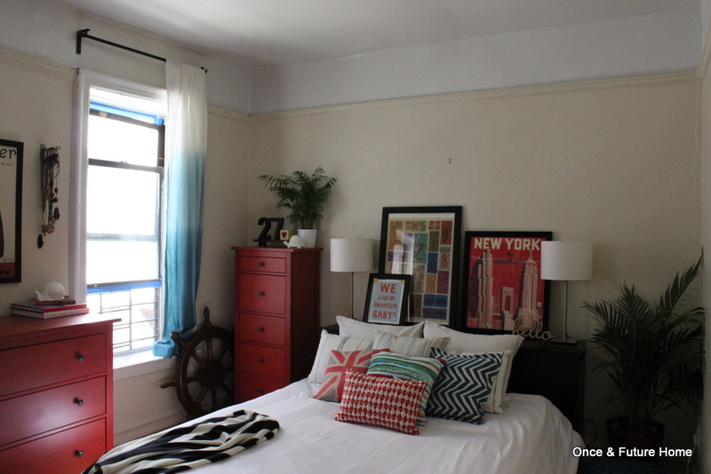
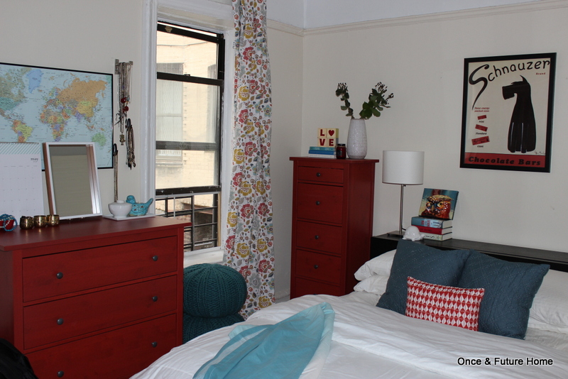
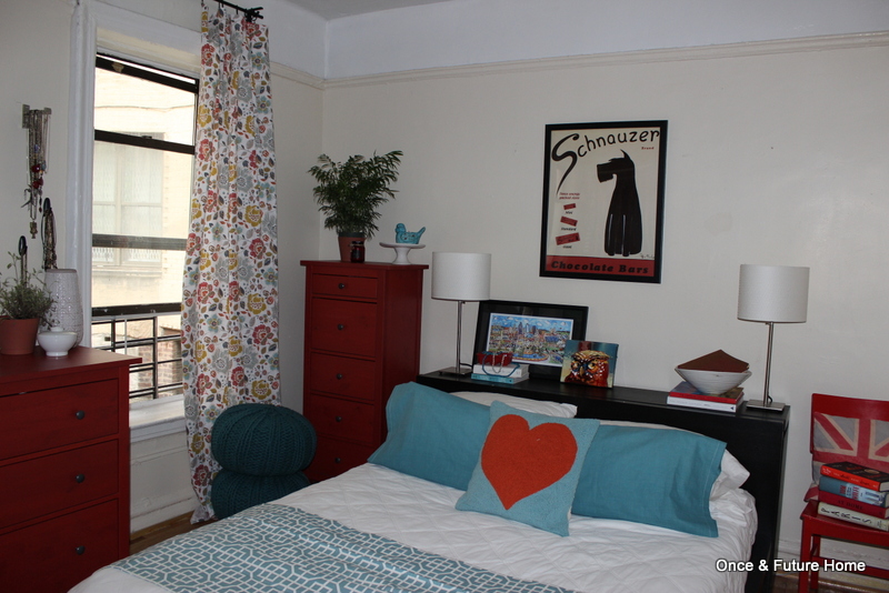
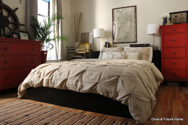
Or we could call it warm neutrals? I get the Pottery Barn feeling because there's a mix of pattern in subdued colors and just enough semi-contrived "found object" detail in the styling (hello, ship's wheel). If I had added a chalkboard ampersand somewhere, the look would have been complete.
This was a fun look to put together because I wasn't sure if it was doable in a way I'd be happy with. When it comes to color combos, red is tricky. I love it with teal; navy is nice but nautical and can bleed too overtly patriotic for my taste, and black and gray are nice complements, but can get really vampy really fast. Purple and pink can both be stunning in the right hands.
But red and green? Christmas. Yellow? McDonald's.
Or is it? I thought I'd try my hand at red and yellow.
This reminds me of high school. An older friend in beauty school offered to dye my hair for me. I asked for red with gold highlights - thinking auburn with golden blonde streaks, natch. This being the late 90s and all. Though that may well have been hideous, we'll never know, because she gave me what I asked for: Red. And Yellow. It was McDonald's, on my head. I cried.
So let's be clear: when I say red and yellow here, I mean subdued farmhouse red and some pretty, not-in-your face gold, bronze and yellow accents.
There's some real yellow: That file box, and the flowers in the throw pillow. But most of it's more gold bronze, layered in with warm taupes and cafe au lait.
This little vignette may be way too kitchy for some, but I just love the bike in front of the bike print. It looks like its shadow! It's the little things.
The thing I love most about this result: It manages to make the red dressers themselves more of a neutral. You can work with the red, but it turns out if you just sort of ignore it, it blends away. Fascinating.
So shall we do a breakdown?
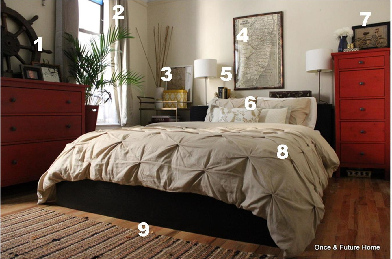
Pottery Barn Inspired Bedroom Budget Breakdown
1. Dresser Styling. The ship's wheel belongs to our homeowner's and is making its second appearance. There's a framed photo of Lou up there; the frame was $1.50 on clearance at Marshall's and it normally lives in our family room. The other piece of art is a drawing of three hands making the ASL signs for MOL. I just thought it looked cool. $2; we've had it for a while and it also usually goes in our family room.
2. Curtains. These are Target's Threshold. I bought these on clearance (at Target) for $5.38 a panel. They're lined and a bit shimmery. I actually bought them for my mom, but when she passed on them I figured I'd find a place for them. And here they are! Still too short for these big windows, but if I keep 'em, I'll do something to lengthen them. Four lined curtain panels for about $22 is very hard to beat.
3. Side Table. The bar cart is a Target/Goodwill find for $25, mentioned here. It's topped with a Target clearance vase, maybe $4, a Target clearance file box for about $3 (both several months ago), and a framed map print that I cut up from a $2 Marshall's gift bag. The frame itself was a $7 Goodwill find - it's Ikea.
4. Art. This map, of The Jerz, is a sheet of wrapping paper from Kate's Paperie for about $20. The frame is from Amazon for about $30. I'm really disappointed with the quality of the frame, so if I had to do it all again, I might invest more.
5. Headboard Styling. You can't see them super well in this photo, but the lion bookends I'm using here are just awesome. I normally use them as door stops, but they work perfectly as they were actually intended to. They were free. #trashpicker. The silk-ish Chinese print box on the right side is the box an actual decoration (not pictured) from Xi'an, China came in. #wastenotwantnot
6. Throw Pillows: The back two pillows we've had fooooorever -- since our first apartment together, actually - and which normally live in our family room. They've got a subtle yellow thread diamond pattern and gray-striped border. Apparently, I love them, because this is the seventh place we've lived in together, and they're here with us. The flowered pillow is my place mat masterpiece for about $5. You can see the how to here.
7. Tall Dresser Styling. I already shouted out this little bike. It was $13 from Marshall's, and I adore it, right down to its little kickstand. It sits on the same $2 Goodwill shelf I've shown in other stylings. The bike print is yet another $2 cut up and framed gift bag from Marshall's. Vase and inlay-inspired box homeowner's. Little brass cup is mine and part of a set of three I thrifted a few years ago.
8. Bedding: Target/Goodwill for $15.
9. Rug. It's the homeowner's. I just kinda love it. I love that it's a rag rug -- I like how casual they are -- but I feel like the color scheme elevates it a bit. I also love that it hides dirt like a champ. Our homeowners actually use it in the kitchen, but since I can't deal with rugs in the kitchen (crumbs, clumsiness, that sort of thing) it's been playing musical rug in other rooms.
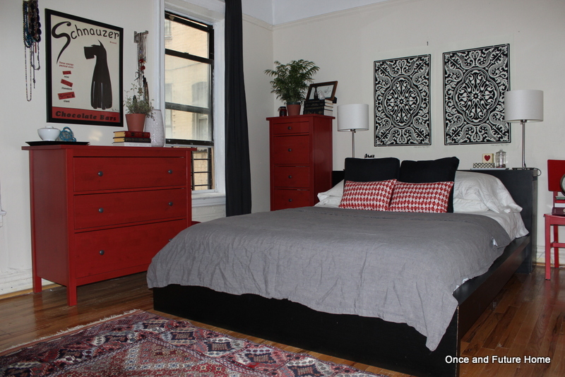
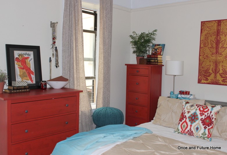
And there you have it! It's cool to see the styles (from our kinda crazy master bedroom styling extravaganza) all together: the difference is striking, at least to me. (Click on each image to see more). And fear not: I've still got a few coming! In the meantime, I'll be sharing some progress on Lou's room, some good eats and some fun random projects. Happy Monday!
