(Hello! Sorry this post is late. It turns out you need internet to post, and we've been camping in Montana with none of that nonsense! But here we go!)
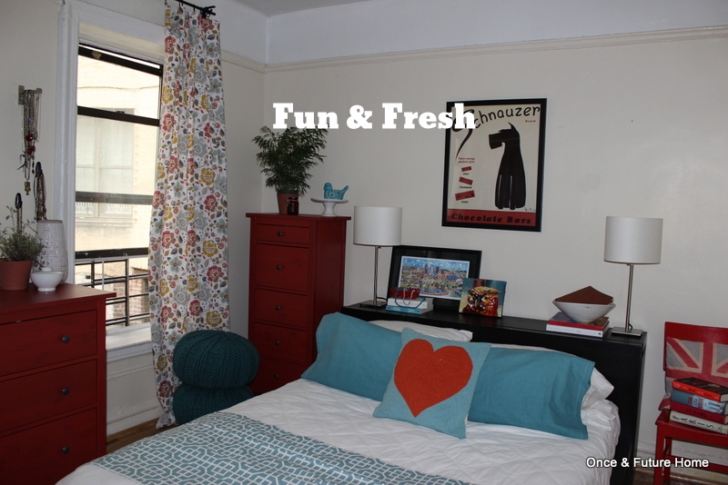
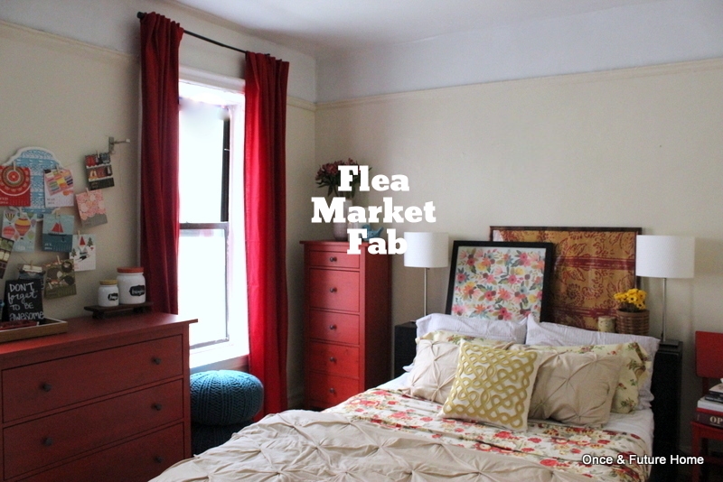
So, you may think this look is just a bit similar to Flea Market Fab. You'll be forgiven for thinking that -- it was inspired by Flea Market Fab. The thing is, I loved the flea market look. (Bret was out of town when I did the Flea Market look, so I didn't know at this point that Bret wasn't a huge fan). But though I loved the vibe of the flea market room, I still wasn't digging the red curtains, and we had only one pair of them anyway. So I was open to any sort of similarly-vibed window treatment, should it materialize. And in the Marshall's tableware aisle, it did.


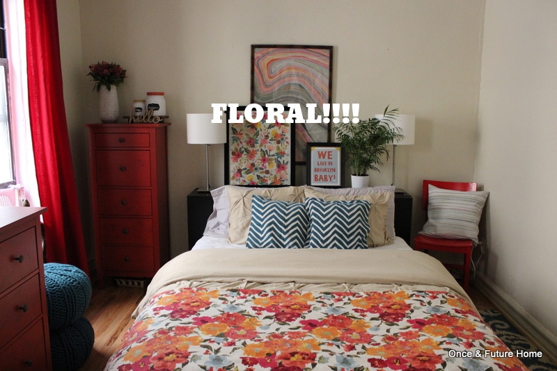
I brought home the tablecloths, clipped them up with drapery rings, and dove into styling. I was very excited. I thought the pink and orange in the florals was unexpected with red, I loved that I could bring in the marbleized paper above the bed, which jammed perfectly, and that pretty floral I'd been crushing on. I was pretty sure that this was it.
But once everything was in (or at least the bare bones) it most definitely wasn't. Bret suggested trying to tie the bed in more, so I threw the red throw (curtain panel) across the bottom of the bed, but that didn't do it. I though the whole thing looked blah. One major problem was that the curtains/tablecloths were orangifying the light coming into the room. Now it occurs to me that lining the curtains may have solved that problem - but it wasn't the only issue. Another was that the pattern, which I seriously loved, was sort of getting lost when hung as curtains. You didn't really appreciate the flowers. You were just assaulted by the vomit of orange and pink and blue. Even though my visceral reaction was deeply opposed, I left them up for about 12 hours to see if I'd adjust to them. I didn't. Though I remembered to snap a photo, I was in such a hurry to remove the offending orange that I forgot to put art in that third picture frame.
But I figured it was worth one more shot with the pattern, so before stuffing it inside its packaging, I used a tablecloth as a bedspread/throw and brought in more teal with my napkin pillows. I also added an actual third piece of art -- the We Live in Brooklyn, Baby print I love so much -- and was really pleased with how it was shaping up.


Actually, surprisingly, really pleased. It made a critical difference to bring the floral down and allow it to breathe, while bringing those red curtains back up. Though I was still thinking of this as a rough draft of sorts, I thought we were making heartening progress, and that my curtain/tablecloth purchase was being vindicated. So I asked Bret, with whom I was Skyping while all of this was going down, what he thought.
Um, he wasn't a fan. Bret was out of town when I did the Flea Market look, so I didn't know at this point that the general vibe wasn't doing it for him. It turns out none of the overblown florals were his cup of tea. It's very feminine, that's for sure. And certainly to a certain taste. (Mine. Sigh).
So gave up on the curtains I was sure I'd be so happy with. Even when I was returning the tablecloths to Marshall's, the cashier commented on how pretty they are, and I sadly agreed. To me, they are really pretty. They're just not meant for our forever room. (The cashier did not, happily, comment on why I was returning 4 of the same tablecloth in the first place).
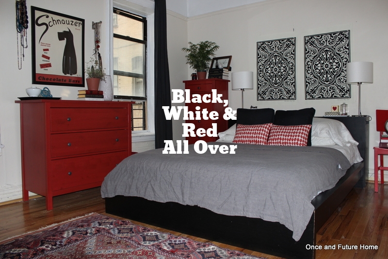
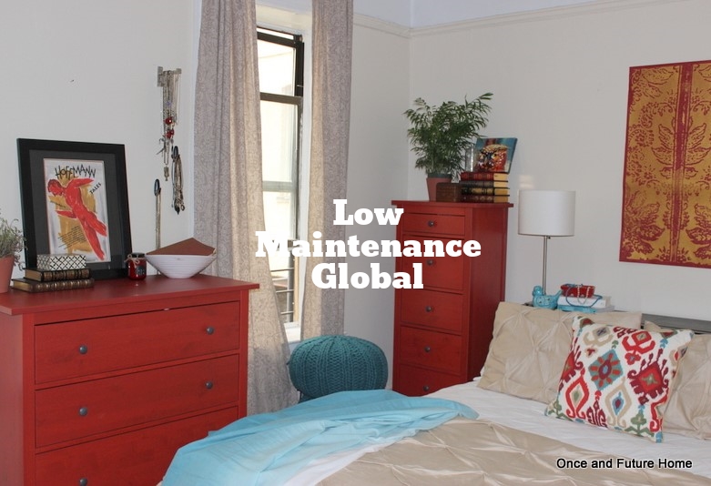
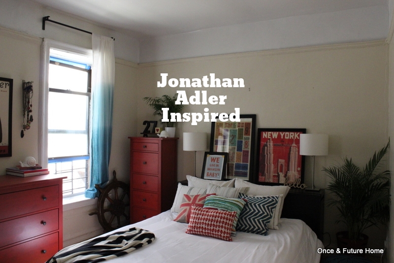
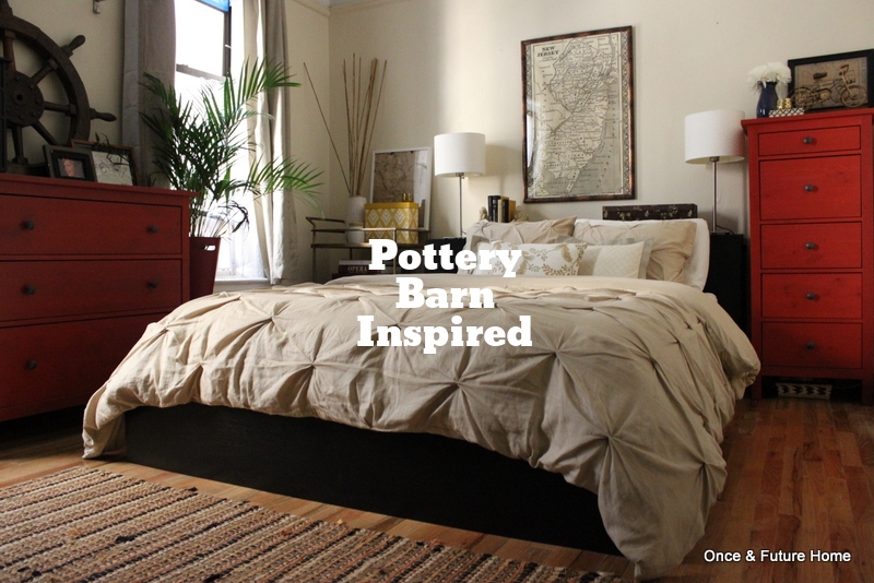
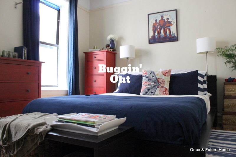
So what do you think? And for comparison's sake, here're the other looks (click through for more):