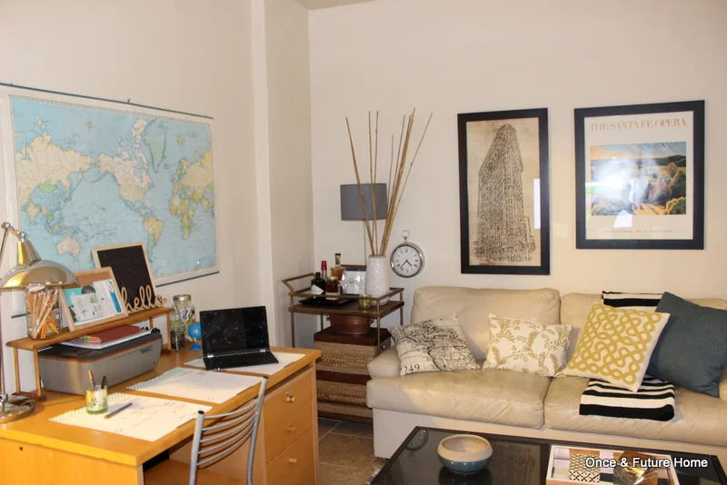
Our Family Room Now
As we get ready to head to our next place (and some of us can hardly sleep for mental furniture rearrangements), I'm doing my best to snap some images of how we're leaving this place. One of the fun things about living in a furnished place (with super chill homeowners who are stoked to see what changes you make) is to see just how much of a difference you can make with the lowest-cos -effort of changes: accessories and furniture placement. Changes like that are accessible to everyone, no power tools or big budget required, so I am glad we had a long experiment in making them.
If you've swung by the home tour page, you may remember what it looked like before.
A European
Living Room
Before
Clearly, this room was perfectly lovely in the "before" stage. Though I should note these aren't the absolute "beforest" of pics. We had already moved the desk out of Lou's room (our homeowners use Lou's room as an office/guest room) and into here, and the two side tables (bar cart and trunk) are both ours that we shoved into the space. Everything else is the homeowners', and though I appreciate their style, once we started taking out some of the red, I couldn't stop myself. (Some people dig red in decorating. Other than for Kitchen Aid mixers, I find it isn't very calming, and I'm always looking for help in calming the eff down).
So, we took out the red, and replaced it with gray. Though there are changes I would keep making to this room if we were staying longer, especially to make the desk area more functional, overall I love how it ended up reflecting our personality and serving our needs for the room. If you've been following along, you'll see that we've made changes even recently. We moved the art and craft supplies from the main bookcase to the Ikea Expedit that serves as a media console. I like not having them front and center when you enter the room now. I also updated the reading nook with a sprayed-gold candle tray from Ikea topping my plant stand table.
I also tried a bunch of coffee table toppers, but ended up just removing them in this last iteration. There is a lot of pattern going on in this room, and adding some to the coffee table, and the bookshelf backs, which we also played with, just seemed unnecessary in the end. Perhaps if I had found the perfect paper or fabric, but failing that, the original states work just fine.
Source-wise, most of the furniture in there is the homeowners, and I *think* it's all Ikea except the cream leather loveseat. I'm not sure where that is from. The bar cart if from Target, though I snagged it at Goodwill for $25 (you can read more about scoring Target stuff at Goodwill here). The long coffee table on the right is a storage table/bench, that I found at Marshall's on clearance for$99. I love it. Accessories, I have a thing for Target clearance, as evidenced by the mirrored tray and blue bowl on the coffee table, white vase on the bar cart, and file box on the storage table (which I have on its side, topped with magazines and a framed New Yorker cover. It stores any stray mail that comes for the homeowners, so it doesn't need to be super accessible). Throw pillows are thrifted, mostly from Goodwill's new Target stuff, but the yellow flowered one is a cover I made from a place mat. Both sets of curtains were new, in packaging from Ikea that I found on different trips to Goodwill, and the black and white striped blanket is also Ikea, from Salvation Army for $7. Sometimes, it pays to spend all your time at Goodwill. Art above the sofa is the homeowners, but I know the Flat Iron building print is from Pottery Barn. Art on either side of the TV is ours: gift bag art, party supply art and thrift store art, all accounted for. Let me know if I missed anything yourre curious about.
So, that's the before and after of the family room. We're already filling up the apartment with stuff for the new place, so I'm going to keep snapping super quick "after" photos while I can. The countdown is on; we'll be in a new place next month! Thanks for reading, and have a great start to your week.


