Greetings, from snow-ifying Honey Brook, PA. Ah, the joys of wintertime.
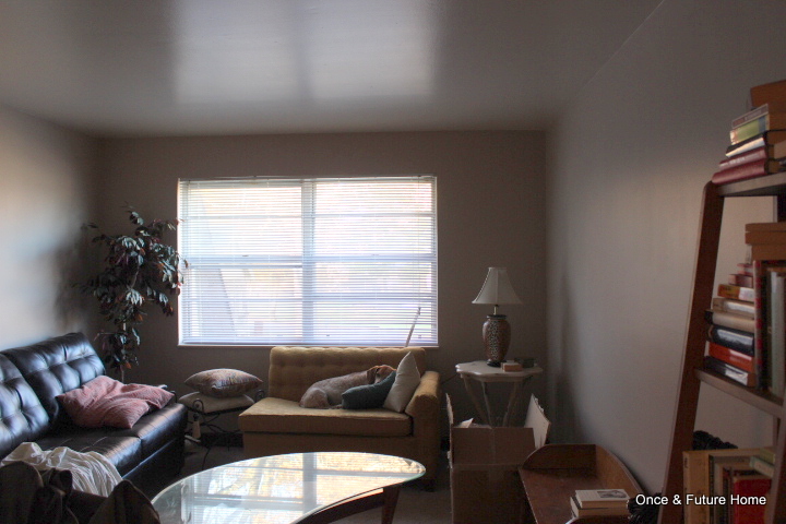
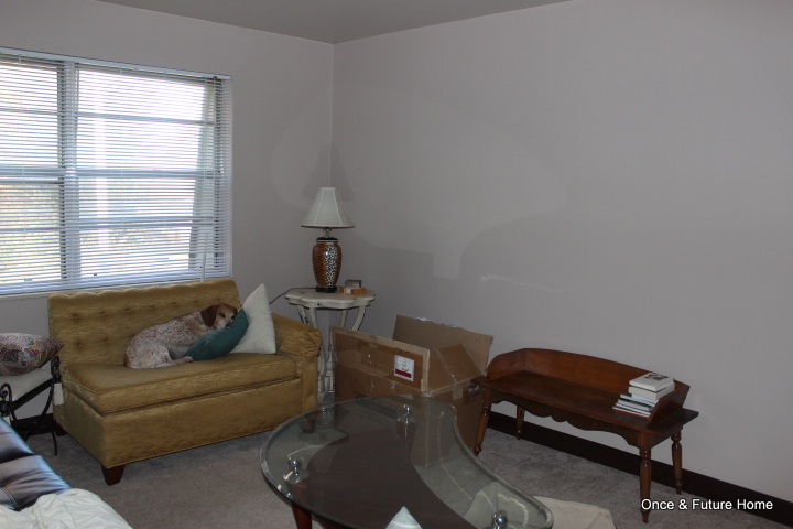
Yesterday, we talked about my friend Maria's apartment in Nashville, TN, and our three day quest to take if from drab (and overwhelming) to fab (and friendly to life activities). We were thrilled with her bedroom. We're beyond thrilled with the family room. Here's how we started out.
Maria has great, quirky taste and a willingness to rummage around thrift stores and boutiques for the perfect pieces. She had already acquired most of the major pieces, including the yellow settee and coffee table, both thrifted, the cool bookshelf from World Market (on a gift card) and the brown leather sofa that she scored new for $200(!). The real issue was that she wasn't sure how to arrange the room - or how to make it "a room." Enter me, stage right. I love arranging rooms. I find layouts challenging and fun, and the difference the right layout makes is instant and intense gratification.
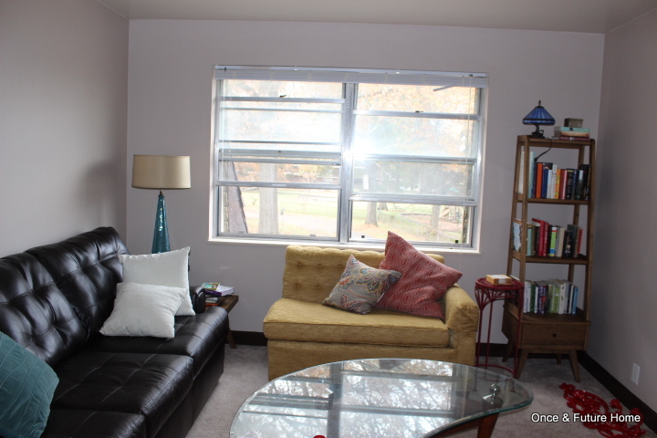
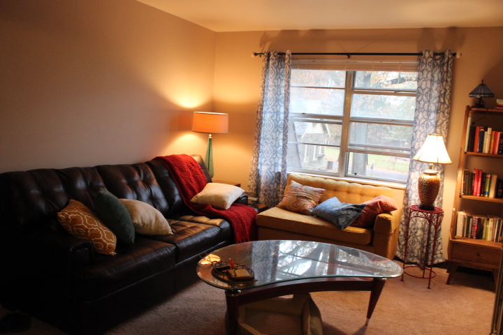
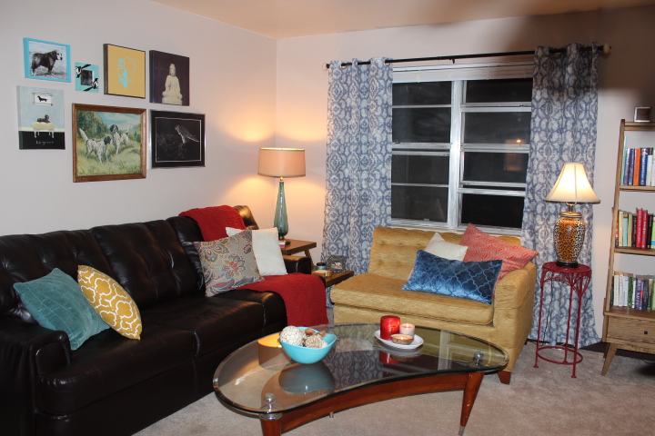
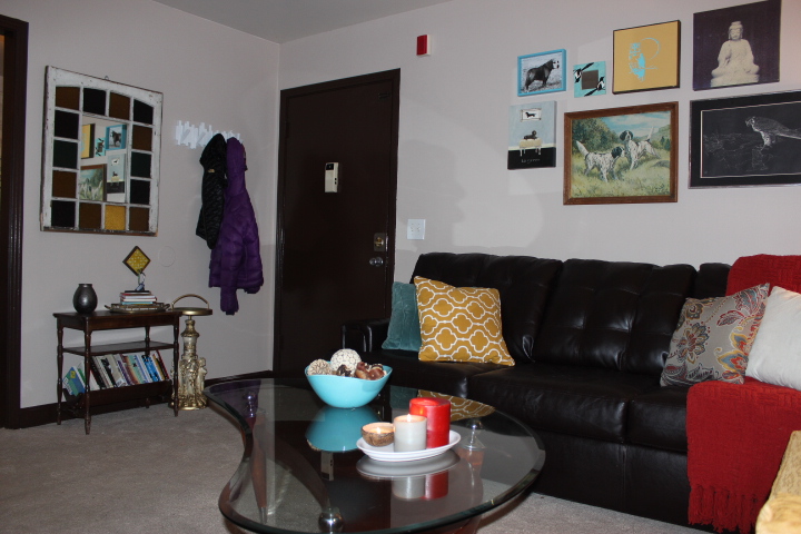
In this case, the main players were where they needed to be. We just needed to add in supporting furniture and accessories to make the room feel homey. Here's where we ended up:
I LOVE it. I know Maria loves it, too. The eclectic, collected vibe is exactly her, which is so neat to pull off. I thought a little slide show showing the stages might be fun.
Here's what we did.
1. Adjusted the layout. Even though the couches were already in their final resting places, we needed to adjust slightly to create a more homey L, and make sure there was plenty of walking around room between them and the large (but awesome) coffee table. We moved the bookshelf to the corner and added a side table (it had been hiding in the guest room) to the opposite corner. To add more light and layer in interest, we topped a red plant stand with Maria's fave cheetah-print lamp - which is nicely balanced by the tall and gorgeous blue lamp (both thrifted).
2. Added awesomeness. We found the green sideboard/credenza/console/TV stand at the Nashville flea market. We bargained down to $135 and it is like my favorite thing ever. I was sorely tempted to try to get it on the plane home with me. I just adore the front paneling, and the weathered chalky green finish ended up playing surprisingly well with everything else we had in here.
4. Softened things up. Never doubt the power of some fabric to tie together a bunch of disparate pieces. The lack of window treatments in here was glaring. We found these curtains for $17 for 2 panels at Ross. They're not wide enough to act as real, light-blocking panels, but they're too sheer for that anyway. Even as dummy panels meant to stay open, they immediately made this room feel finished and cohesive. That's true even though the blue they bring in isn't referenced in many other places except one toss pillow. Speaking of toss pillows: that's where we spent the big bucks. Maria had already acquired a few before I got here; we added two more and a throw to drive home the color palette (blues, rusty reds, mustards) and create a little softness. The pillows are from Target, Ross and TJ Maxx, and range from $10 to $20. The thick, rusty throw is from TJ Maxx for about $20.
4. Hung art. Maria had all of these, and we got lucky: there was enough bright teal and enough repetition that they create a fun but cohesive display. I think Maria will update these as she updates her art collection and finds things she loves, but for now, this free little collection takes up the right amount of space above the huge sofa and showcases Maria's loves: dogs, the hawk, and quirky birds.
5. Added function. The front wall was just a yawning stretch of emptiness. Maria had stuck a coat tree in a nook in her kitchen, but this little stretch was was crying out to be put to use, so that's what we did. We hung the mirror to reflect light (this place is pretty dark, and we were constantly looking for ways to brighten things up), added a hook for keys, a row of hooks for coats and leashes, and a small table to corral all the crap one needs walking out the door: coupons, shopping lists, pens, coins.
What we/she might do later.
1. Switch out the art. Though I thought it was a lucky break that these quirky little pieces worked so well together, I also think that art should be stuff you love (even if it's just a framed gift bag you love). I think watching this wall evolve as Maria collects or receives more loved pieces will be great.
2. Add in a TV. Though we scored the TV stand this weekend, we thought it best to wait until Black Friday or Cyber Monday to try to scoop up a cheap TV. Maria's not a big TV watcher, but that's nothing actually having a TV can't change :). Ideally, she'll be able to wall mount the TV a few inches above her console, but it'll still look nice even if she has to rest it on the console.
3. Paint. The walls are the same taupe in here as throughout the apartment. The color was highly offensive until we started to like the room, at which point it really faded into the background. Ditto with the dark brown trim: we actually bought paint to paint the front door a fun mustard color, but once we'd finished with the room decided it wasn't necessary. Maria may paint the walls (a really light aqua would be lovely) or trim (white!) or both; we'll see. Those are work-intensive projects, and once you have a room to your liking, it can be tough to muster up the resolve and the drop cloths.
Because I can't resist, here are a few more shots.
I even like the nighttime shots! I won't be posting tomorrow, but I hope you have a gratefulness-infused day with lots of your favorite snacks. My plan is to see you Friday!
