Hello! Happy Monday! Happy November! Thanks for your patience last week while we rounded up our belongings and made the big move...about a mile and a half away. You wouldn't think such a move need be complicated, but here at Once & Future Home, we strive to make things as difficult as possible. To wit: this move involved emptying our storage units in DC and Pennsylvania and combining them with our Brooklyn stuff at our new place. Guess what. We have a lot of stuff.
Oh the joys of unpacking.
And a lot of it, we had forgotten about. And even more of it is somewhat dated in terms of our lifestyle. Ah well. These next several days will be a real thrill of discovery, I'm sure. I don't want to brag, but I'm known for being a pretty fast unpacker/settler in. But even my skills are sure to be tested by this hot mess. I promise to let you know if I develop any tips or tricks. In the meantime, I have the beforest pics ever! Wanna see?
First up, the front hallway. Here's the view of our front door. You can see a couple closets on the right, and there's an entrance to the living/dining area on the left.
Front Hall Before
Kitchen Nook Before
This little tiny nook precedes our kitchen, and I have outsized plans for it. I mentioned a perfect wall for chalkboard paint in this space: here it is.
Then comes the kitchen.
Kitchen, sort of, before.
Somehow, this is the only shot I got of the kitchen. There's my hardworking hubs making Lou's lunch. Because no matter what your apartment looks like, the show must go on. You can see an awesome little bonus nook at the end of the kitchen, on the right: perfect built in pantry. Already more food storage than at our last place! But counter space is even more scarce here, so that spot behind the couch will have a dresser-turned-kitchen-island that I'm pretty excited about. The living/dining space pictured above extends the length of the apartment. The previous owners had the living portion close to the windows (so keeping the couch pretty much where it is now), and the dining portion closer to when you walked in; I'm thinking I might switch that. Only time will tell. You can see a better idea of the layout in the House Hunter photos, here.
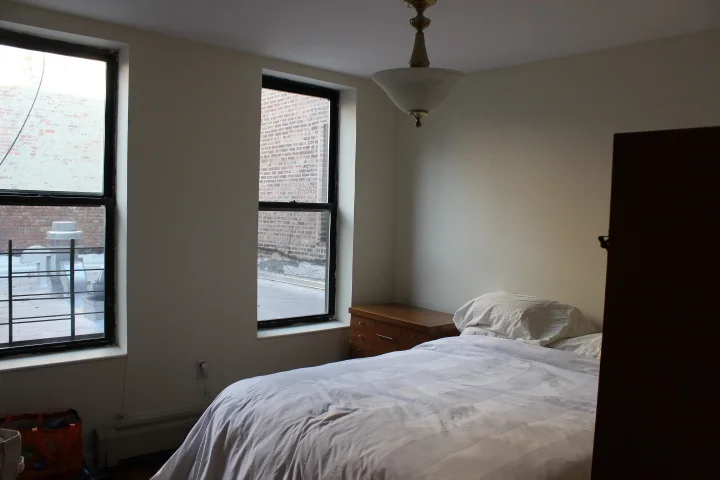
Master Bedroom Before
Here's a question for ya. Is it really a master bedroom if there's no en suite bathroom? Is calling it the master somehow non-PC, or does it harken from English gentry and not slavery? Someone, please, Google that stuff and get back to us. Anyway, this currently humble room is our master. Things I am excited about: that dresser in the corner, whose twin is on the other side of the bed. I love that dresser, and have missed him and his brother since I abandoned them in DC so long ago. They're like my first piece of real, non-thrifted furniture that I paid decent money for that wasn't a couch.
Directly across from our room is a spare room of sorts. It's going to serve as an office/guest space, and having a dedicated area for those two things is the height of luxury. Also, we can use it as crazy storage as we slowly make our way through our boxes. The only thing that's a bummer about this room is the lack of light; it's window opens up to a sun tunnel, not the actual outside.
Guest/Office Before
Down the hall on the left (so just past our room) is Lou's wee spot. There was some confusion when I mentioned finding someone small to put in this space. I meant Lou. She's still pretty wee (though getting harder and harder to carry). We put a lot of thought into giving her the small space, and I still stand by it. But one key tenet of the plan was being able to put her twin bed width-wise in the room. The bed can't fit like that, so now we're reevaluating. But here it is now, with part of the bed in place. We put Lou's old crib mattress on it for now, 'til we get a new one. My dad built the bed for us; lots on that later.
Lou's Room, Before
At Lou's room, the apartment dead ends and you can only go right. There you'll find the Great Hall of Closets. There are three closets lining the hall (which leads to the bathroom) here. One for each bedroom. Which is good, since none of the bedrooms have closets within. Should be interesting configure these.
Hall of Closets, Before
And finally, the bathroom. There's no natural light at all back there, and I'm not awesome with the camera in tiny spaces, but here's a shot of the situation. (Yes, that's our duvet cover serving as makeshift shower curtain. What?).
Bathroom and Nook
Sorry for the open toilet shot. Don't know why I can't stop taking those. From this angle, you can both see that the bathroom itself is very small, and also that there's a wee nook behind the door that will very likely become a laundry/dressing/linens area.
This place is quirky. It's got a ton of light in half the house and none in the other. It's like living in a yin yang symbol. The floors aren't super even, the closet situation is a little wonky, and we have more stuff than I remembered, which I now have to figure out how to work in (or not, as the case may be). But all in all, I'm excited. It's a challenge, that's for sure. I'm thinking I'll make it a 28 day challenge, for no other reason than when I titled this post Day 1, it reminded me of the movie 28 Days Later. So let's see what we can do in 28 days, shall we?


