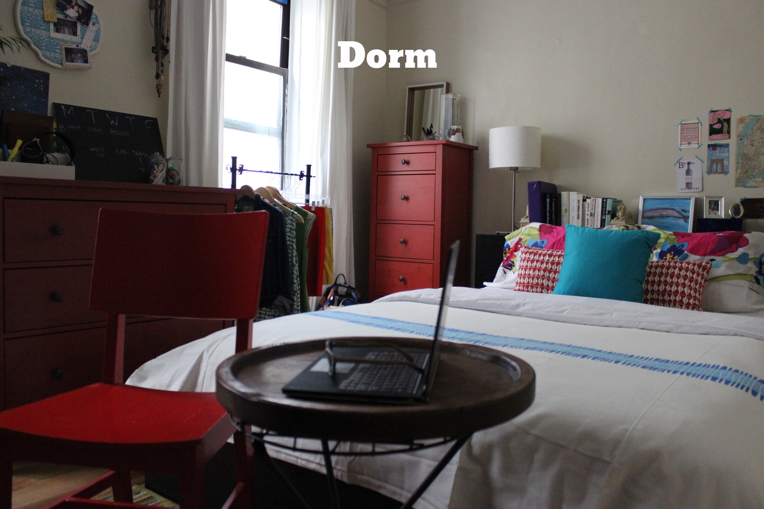
Find your style bedroom decor: Flea Market Fab
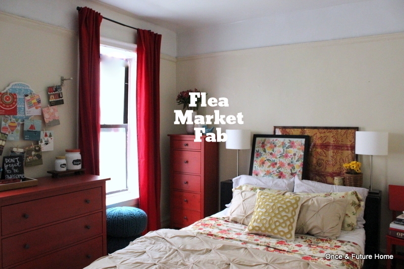
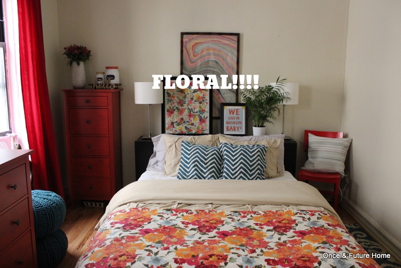
Well, well, well. What have we here? A mishmash of pattern, some florals, and some actual flowers. Actual pinks! Some lightheartedness and a sense of having collected things over time. Oh, I love it.
This whole bedroom restyle project has been fun for the obvious reasons -- an excuse to redecorate my bedroom every coupla days -- but also because it has involved some pretty serious soul searching.
Well, maybe not quite that serious. But it's been really handy in terms of taking a step back and examining what we each like or don't like in the different rooms as they come together.
And this look, as much as I love the more graphic, clean-lined, playful vibe of a lot of design these days, this look really speaks to me. Even with its firm, slightly-more-than-just-friendly embrace of the red, I dig it. I don't suppose anyone who's ever actually been to my house would be surprised. Even if I was.
I like flea markets. I like big, 80s floral patterns (thanks Mom and Grandma) and I like unexpected items serving a purpose. See, e.g., my kitchen wear serving as jewelry storage.
I might be tempted to declare this look the winner, except sadly, it's been voted off the island. This look is not really Bret's jam. Fair enough. It's still instructive to check out what exactly about it makes it feel like home to me -- and what he abhors. Then we can move onward and upward.
Whilst we do so, shall we do a breakdown?
1. Art. On the wall, a Paper Source desk calendar I cut up and clipped to twine using clothes pins. (2014 calendars are 75% off now. I think this one was $4). On a whim, I hung this $3 Target via Goodwill pushpin board behind the calendar. There was a nail there I was trying to hide, and then I think I just forgot to take it down. It's a little busy.
2. Dresser Styling. So here we have my kitchen. The blue colander ($10), my favorite (and pretty much only) kitchen accessory is sharing necklace-draping duties with my normal egg crate ($3), all stacked on a tray from the family room ($3) -- and all from Target clearance at some point or another. Ditto the candy jars; Target pretty recently for $3 and $4 each on clearance. They're resting on a $2 Goodwill shelf. The "Don't Forget to be Awesome" phrase is borrowed from the vlogbrothers, of whom we're unashamed fans, and I wrote it on the deconstructed base of the desk calendar set I hung up, above.
3. Curtains. Our homeowners', originally in the family room. I believe from Ikea. They're nice and long. Those teal poufs are the $12/each Target clearance poufs that so frequently make an appearance.
4. Tall Dresser Styling. A Target clearance vase ($4) with some pretty pink flowers to drive home the pink point, some white books, and a blue bird borrowed from my kitchen.
5. Art. Two gift wrap prints. The blue floral is from Paper Source for about $6; The red damask is from Kate's Paperie for $9, I believe. Remember it from this look? Some flowers in a jar I hid in a thrifted basket (maybe $1?) and a little tin actually from a flea market, years ago.
6. Side Table. The red chair is back pulling shifts as side table. It's layered with books, a $2 white Goodwill tray (originally from CB2, I just noticed) and a $3 Target turtle that Lou just broke, so let's all be glad to have this photo of it doing what it loved best.
7. Pillows. The new $3.50 pillow cases from Target's dorm line that showed up last week. The floral body pillow case is a scrap of fabric from a local vintage shop for $5. The yellow-patterned throw pillow is from our family room. I got the pillow cover at Housing Works, a local thrift store, for $5. I love that silly pillow.
8. Bedding. The pleated red floral bedspread is a curtain panel from the same vintage shop where I found the body pillow cover. I think I paid $15 for it. Which for me is insane, for one old curtain panel for heaven's sake, but I just looooooved it. I had to have it. I even love the draped effect the pleats create. Yes, please. Plus our usual Target via Goodwill pin tuck bedspread for $14.
So for the amount I actually spent on this room? $128 if I include all the accessories (but no furniture, nor the curtains, which aren't ours). I know, my methodology seems to keep changing. In this case, nearly everything in here, except for the egg crate and blue bird, was pretty recently purchased -- since let's say January of this year -- with this apartment, if not this room, in mind. So I just figured I'd include it.
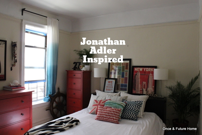
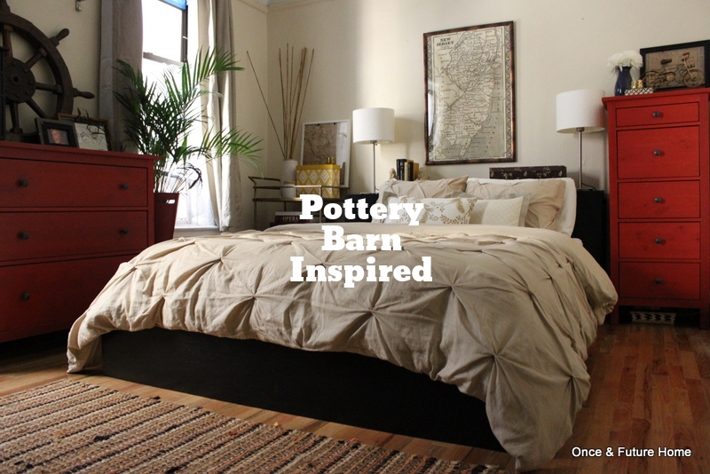
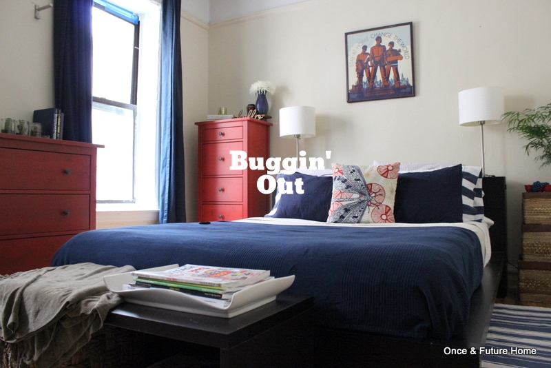
So whaddya think? I wasn't necessarily hoping to love this one; I really like all nature of design, and so far I've thought the Buggin' Out and the Jonathan Adler-inspired were very us. But sometimes love comes around. And it knocks you down.
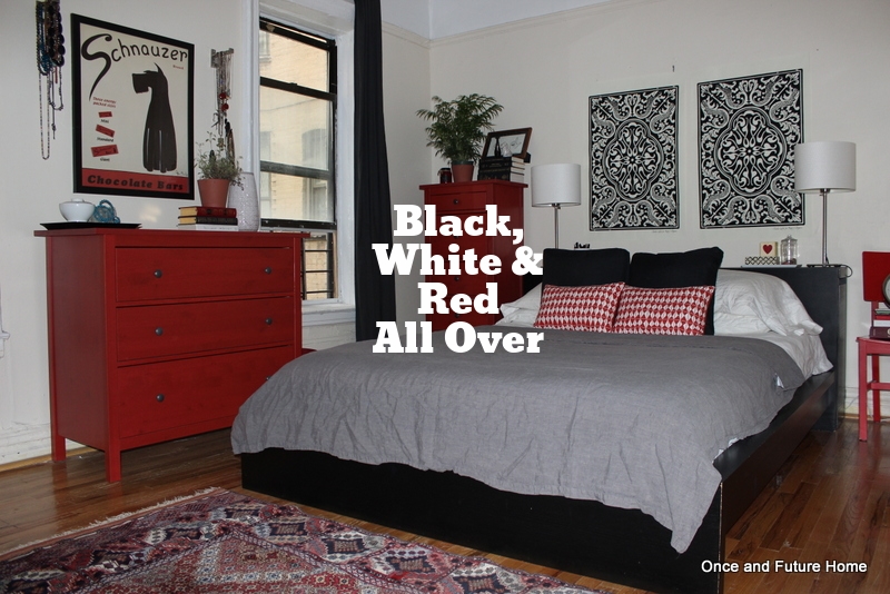
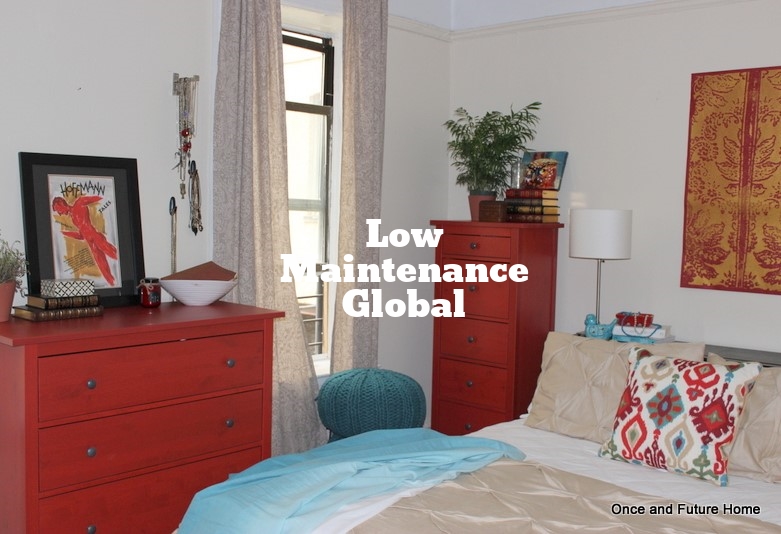
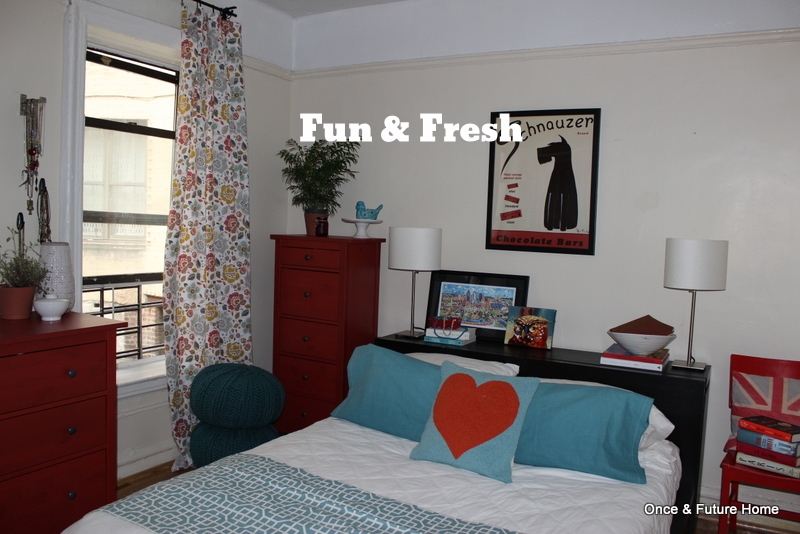
So check out the previous iterations in our Mission: Master Bedroom style challenge. Click through for more info on each. And tell us in the comments which looks you're loving.


