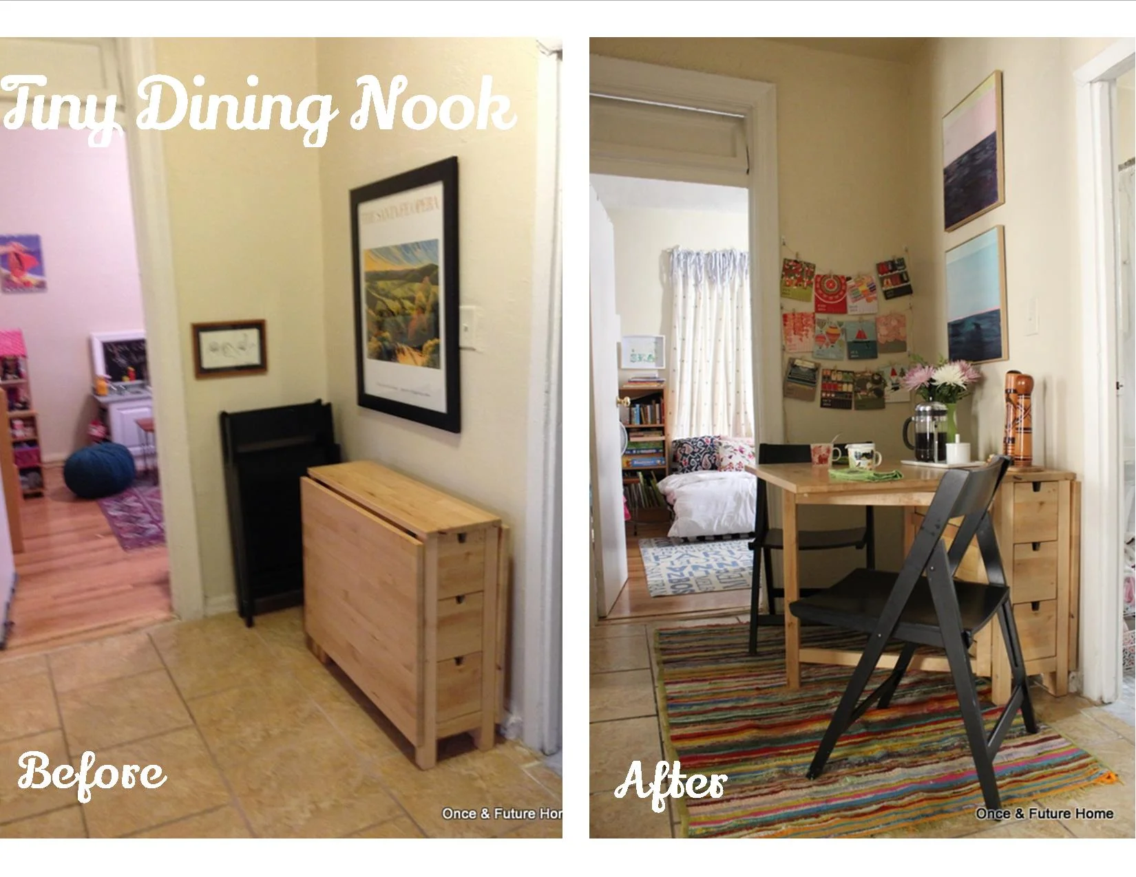
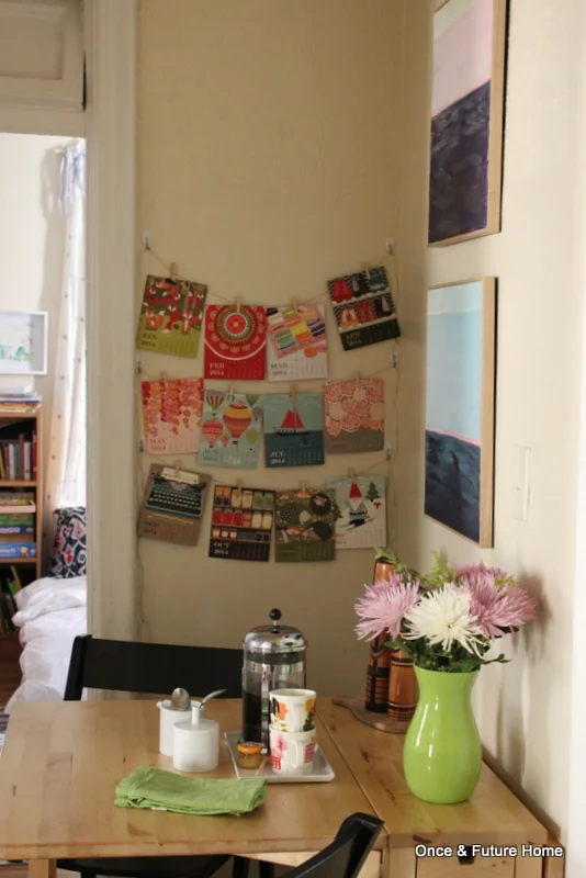
Good morning! It's Monday, which means we're focused on decor/design over here. We've been checking out different master bedroom styles for several weeks, but while that's going on, we're making actual progress in other areas of the house. To wit, our dining room:
Apologies again for the true terribleness of the "before" picture. The lighting doesn't help, but this space really was feeling pretty bleak. We put the table here because there wasn't a good place for it elsewhere, but we were eating in a hallway next to the bathroom. It wasn't glamorous.
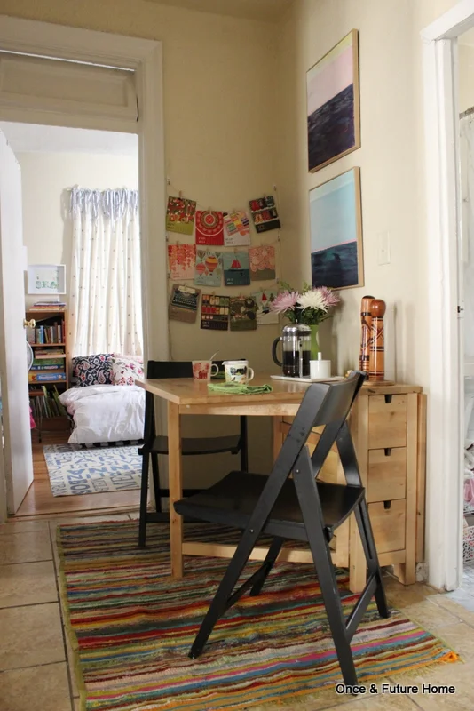
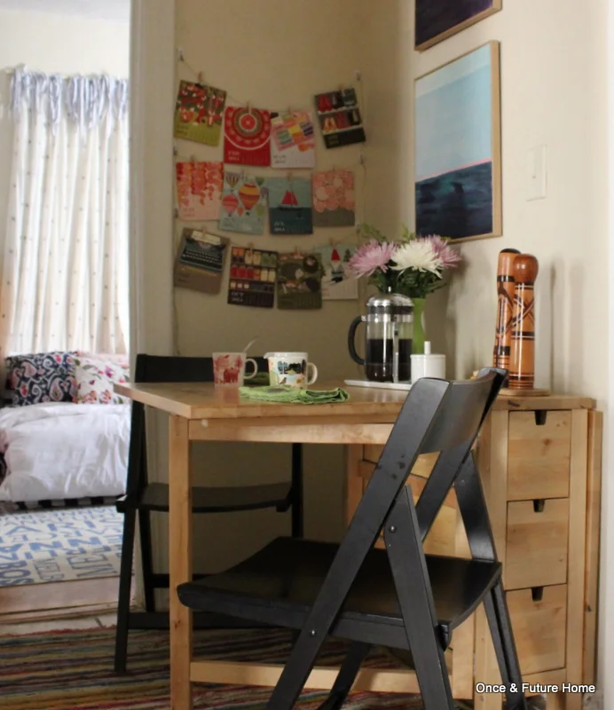
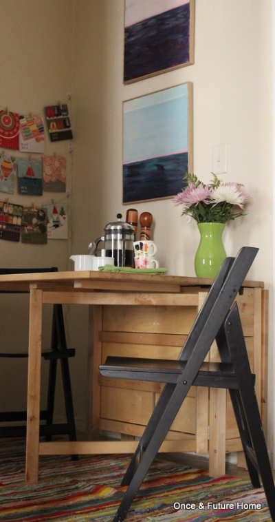
Even in a tiny spot, you can designate an area for its purpose, which I find really helps to up the hominess factor. To delineate this area, we used the oldest tricks in the book: a rug and art. The rug makes it clear that this space is different from the rest of the hallway, and the art makes it feel more like a room. There was art here before, but I think stacking these guys vertically and adding something on the second wall makes it all feel much more intentionally delineated. Flowers, salt and pepper shakers and my coffee paraphernalia all help drive home the idea that this space is for eating.
When we're not actively eating, the table is often folded down, though not always. I go in phases, and sometimes the phase is pretending we have a designated eating area.
As for cost, this little transformation came pretty cheaply. The rug was $5 at a yard sale, the two paintings are from Goodwill for $5 each, and the calendar on the far wall is from Paper Source for about $4. I cut it off its desk calendar stand and clipped each page to lengths of twine on Command hooks. You may recognize it from the Flea Market Fab bedroom look. It's not very highfalutin, but it makes the whole space feel a bit more fun and relaxed, so we call it a win.
All of which is to say: $19 took this space from a pass through to a real dining area, and we're very happy with the change. Are you shoehorning function into a space that wasn't meant for it? Do share and thanks for stopping by!
