Hello, and Happy Monday! Welcome back after the long weekend. I hope everyone's Thanksgiving was fun, yummy and, at least after the fact, a little restful. Mine was definitely the first two, but as for restful, we spent the last couple days at my sister's new apartment outside of Philly, helping her perfect her space. So it was exciting! Bri (that's sis) and her boyfriend, Adam, moved into their one-bedroom at the beginning of the month. They've done a really good job unpacking and settling in, and had mostly nailed the furniture placement, which can be the trickiest task of them all. Today, we'll check out the kitchen and dining room. Here was the landscape when I arrived.
Here's the view from the front door. You walk in and to your immediate left is the dining nook. Bri's got her old dresser, which my mom painted aqua for her, in there, serving as storage and a pedestal for her wee pet turtle. She's also got a tiny bar cart my mom salvaged and sprayed silver, holding bar gear.
You can get a feel here for how they'd arranged the dining table, pushed against the window so that two seats shared a side. I think they did that to make space for the dresser and bar cart, and to allow ample walking space all around. The kitchen is to the right of the dining area and diagonal from the entrance. Here's the before shot.
Looking at these pics, I feel like I should note that we weren't drowning in Corona boxes. We'd picked up a 12 pack to have with our Mexican dinner, which, being in Conshohocken, was BYO. I somehow failed to move the box from every picture thereafter.
Well, that is renter-tastic, isn't it? It's got the hardware-less oak cabinetry, Formica counters, linoleum floors and dated appliances. Bri and Adam got started in here with their cute little coffee cup caddy and Tibetan landscape, but that's it so far.
You can see how this little apartment is perfect fodder for this make-do-with-the-hand-you're-dealt blog, right? Brown carpets, uninspiring paint colors, suuuuuper crappy Venetian blinds. Plus no overhead lighting, and the classic conundrum of the recently grownup set: Handmedowns. Bri and Adam are both really appreciative for everything they've got (really - I'm not just saying that), but it's always tough when you can't pick exactly what you want and need, and instead have to adapt things to your space.
Luckily, that's my jam. Here's what I wanted to do:
1. Hang stuff. When I got here, Bri said, "Good, I'm glad we can start hanging things now and stop living in the asylum." I didn't really notice the bare walls in person, but in the photos, things really look stark. We had a bunch of stuff we wanted to hang, and we were on the hunt for at least one more piece of art.
2. Create a dining area. I immediately wanted to move the dining table just a bit to the area I thought was a more natural fit for it. I understood the impulse to push it against the windows, but I thought it looked unnecessarily cramped, and blocked the view of one of the apartment's best features: those windows.
3. Find a place for that aqua dresser. It's cute, and it provides storage and a spot for Norm the Turtle, but it wasn't working in the dining room. It looked little on the wall, and it also forced the dining table into its spot by the windows.
Here's where we ended up, starting with the dining area.
How do you like the new table placement? It's not a huge change in terms of distance, but it makes a big difference, I think, in terms of feeling more relaxed, like you're not fighting the layout of the apartment, and instead are working with it.
You can see that we got rid of the dresser - it'll reappear in a moment - and added a little more to the bar cart to make it feel like a focal point.
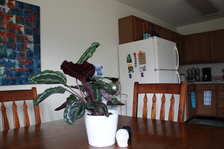
Thrifted bar cart and fun fridge.
I started to work on this huge white expanse of a fridge side by moving their mementos here. Actually, it's almost an almond fridge. Anyway, it's ugly. I have in mind something like our apartment door in our old place --
Remember this? It was so cheery, and really uplifted the drab entry space we had. I have a similar vision for this fridge side. I left Bri with a little garland to hang up, and instructions to find some cute magnets or tape and to get to work. We'll see what she comes up with. Anyway. More dining room shots.
We didn't purchase much for this space, but I did find that painting for less than $30 at Ross. The potted plant, which I think is so pretty I was whispering sweet nothings to it, is from Ikea. Bri had the skull salt and pepper shakers, along with everything but the aqua planter ($4, Ross) on the bar cart and the small flower print above it. Ready for the kitchen?
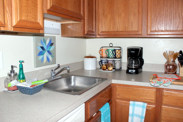
There's that dresser! Norm is up there. While moving a random piece of furniture into a kitchen might not be everyone's choice, here I think it works. That was all dead space anyway, and now the trashcan is hidden behind it, which is kind of nice. We did buy some stuff for in here: the new rug ($12 on clearance at Marshall's), the potholders, which they needed ($6 total, Marshall's), a Mason jar soap dispenser ($3, Marshall's) and some sparkly metallic sponges and scrubbies ($2 and $2.50, Ross and Marshall's, respectively).
It's still a rental kitchen, but I think it's cute. If I had more time and/or money, I think we could do even more. Here are my suggestions for a couple more changes:
1. Swap out the dresser for an island cart, like this bargain from Ikea.
You could also upgrade a Craigslisted butcher block version with a coat of colored stain and some hooks. Either way, turn the top into a coffee station and store cute pots and pans or colorful dishes on the other shelves. Moving the coffee gear would free up a huge expanse of counter to work with. (Huge being a relative term, of course).
2. Figure out a way to cover that hideous light above the sink. I'm thinking a thick fringe or pompom banner, just tacked up on the cabinets. Whimsical and would really help with that asylum feel.
3. I like the rug we've got, and the price was right, but I'd look for something a little bigger, with a more graphic vibe. Something like this?
I'd also use the space above the cabinets to hold a few cute baskets and decorative items. That would be both practical and help draw the eye up and make the space feel as tall as it.
A couple before and afters, to see if you agree that we made great strides:
Not bad! Lessons learned: Don't fight your space. Don't crowd everything against a wall. Opt for streamlined, and to counteract a ton of brown, bring in lightness and white where you can. And for the kitchen:
Cute! And almost no money. Just a little counter-top rearranging, my go-to solution of trays to make everything look neat (here: sugar and cream bowls; soap dispensers), a bigger, brighter rug, and some cute accessories. Easy as pie!
What's your favorite part? Any questions about sources or anything else, shoot me a line in the comments. Stay tuned on Wednesday for the entry, family room and bedroom, plus more tips for turning a rental into a fabulous place to be.


