Hi, and welcome back to the tour of Bri and Adam's refreshed rental, in the Philly suburbs. As I was saying Monday, they moved into this one-bedroom at the beginning of the month, and it's so cute to see how much they love it. Coming from group houses and roommates, it feels so nice to be able to call the entire space their own. As I was also saying Monday, this little place is classic rental, all the way: Dingy paint colors in sloppy paint jobs (why do landlords do that???), brown carpet (ew), crappy blinds. The blinds are the worst! They fall apart if you look at them wrong. And also, ugly.
So can we make a place like this feel pretty? All we ever see are pictures of places that are beautiful to begin with. Even Apartment Therapy,* despite the name, showcases the worlds' most improbably beautiful rentals. They're all sun-drenched and wooden-floored, and, no offense, not that hard to make look good. What if your place is just a brown box? I feel strongly that it can be done! Not only have we done it before - see especially Maria's strikingly similar Nashville rental, from this time last year - but we did it again this time. Let's take a look.
First, the "entryway," by which I mean the completely unceremonious place you enter the apartment.
Here's the view from when you walk in the door. I don't have a great before shot of the door itself, but pretty much this brown square of carpet sums it up. We brought in a little bench - the same $15 Ikea TV stand I'm using in my own hallway - and some ridiculously cute antelope hooks to provide a landing spot for all the stuff.
Create an entry with a bench, a space-defining plant, and some hooks.
There she is! Not bad, right? I don't know why I didn't center that door mat when I took these photos. Sigh. But the little bench is just perfect. It holds a basket for mail, and the small trunk holds important files. The potted plant is clutch. Not only do I think every space should be filled with plants, but this one creates a little division from the "entryway" to the dining room. I "potted" this $12 Ikea plant in a $6 copper colored trashcan from Ross. It needs to be really potted, but trashcans are a decent cheap option if planters are too expensive.
Ikea TV Stand as entryway bench
How do you like those heat registers? Sexy, right? Great opportunity to note that, in addition to donig "real" spaces, I've tried to be pretty real in my presentation of those spaces. (Bad Photoshop job in some upcoming photos notwithstanding). We all have outlets and cords and heaters. I do my best to minimize those in the actual decoration of a space, but if they're still there...they're still there. I think keeping the photos real is a good reminder of the general theme: Any space can be beautiful.
As for the curtains, do you remember them from when we did Bri's room in her group house? I made them, with every last inch of fabric I found at Walmart, and a TON of no-sew hem tape. I know they're a little quirky, but that's what I like about them! It's incredible what a difference they make in this space. There are six panels, enough to cover the whole large window, and they're sheer, so now B and A can just leave those hideous, broken blinds open and draw the curtains for a little privacy.
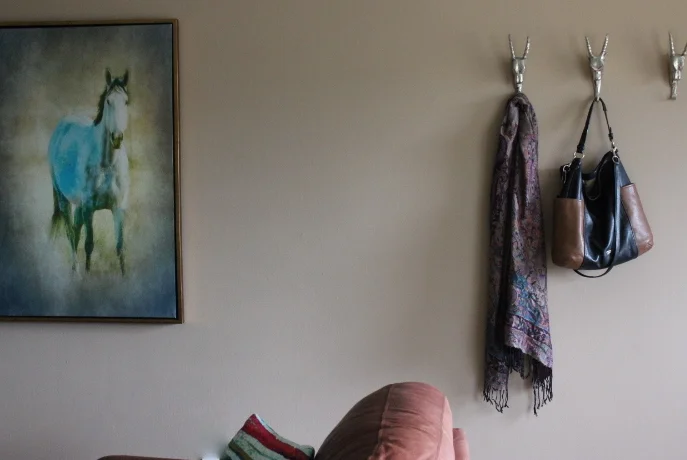
Those hooks are my favorite things ever. I found them at Marshalls for $4 each, and was actually planning to keep two for myself, but I'm the best sister ever, so I gave them all to Bri. Hanging them all across like that look substantial, and hanging them at that height obviates the need for art on that side of the wall. That was Adam's idea, by the way. My instinct is to hang all hooks at a four-year-old's eye level, and he assured me he can reach pretty high. Lurve.
Okay, carrying on: the family room.
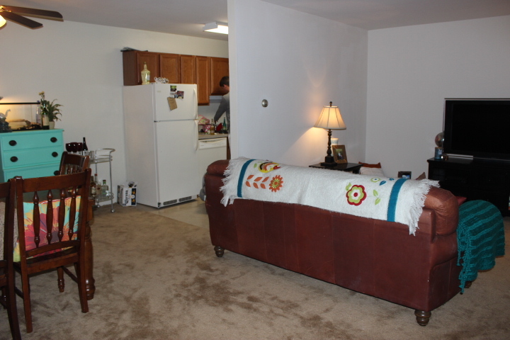
The first shot is the view from the door, and here's the view if you're standing close to the TV. Their first priority was making sure the TV was visible (okay, not to be all sexist about it, but that was Adam's first priority), but I think they did a good job with couch placement. I moved it over a bit to make room for that side table next to, rather than in front of, it, and we edited the throw pillows to remove the bronzey ones that blended in and include only the bright teal that popped.
Contrasting pillows update the couch.
On the other side of the room, we brought in a new chair to add seating and create a cohesive little family room vignette. The chair is $109 from Ikea, and we topped it with some pillows and a blanket we already had.
I think the brown, orange and blue striped pillow is my favorite. As for that poof (covered with a blanket, but you can see it in the first picture better), I think I showcased it when we redid Bri's room in her last house. It's actually a cute, soft-sided storage cube I got from Marshall's for less than $20. Stuffed with spare blankets and pillows, it's a really affordable and cute way to marry storage and comfort.
To recap, we moved the couch to allow for the side table to serve as an actual side table, while still leaving plenty of room to walk by on the right. We added a chair, edited throw pillows and then hung art, including that horse print I got for Bri a while ago. From Ross, less than $30, and it looks just like her actual horse, so I had to get it. The other print is from Urban Outfitters and Bri already had it. The clock was Adam's. It adds quite the air of gravitas, no?
And finally, the bedroom. When I arrived, the bedroom was fairly bare bones, though they had found a really cute orange and white coverlet for the bed.
We made a couple tiny changes in here, and I think the difference is way bigger than the sum of its parts.
A few budget changes for a big impact makeover
This place looks great! Bri had the white storage tower in a closet, so I brought it in here as a side table and put their existing lamps on either side of the bed. Boom: Symmetry. Looks fancy. Then we added to the bedding with a $20 gray comforter, two gray-and-white euro shams (I think $12 each) and an orange-and-gray pillow cover ($14), all from Ikea. Layered in with the gray-and-white and orange-and-white bedding they already had, it looks so cozy. I put the little kitchen mat in here because it matched, and I think it looks smashing. We hung Adam's painting of the London Bridge above the bed, curated the side table and dresser knickknacks a bit, and really, how grownup and finished does the whole thing look?
There's only one thing missing.
No curtains :(
That air conditioner is so hot right now. Heh. Also, this room is in desperate need of some curtains. The situation is dire. I have gray curtains that I nixed from my family room that I can send; we're also investigating raiding my mom's stash of extras. Waste not, want not, right? The lessons learned in here is that more is more when it comes to bedding: Adding in a solid gray really tied together two patterned pieces, and then the pillows bring it all home. Corralling the goods on the desk with a tray, matching lamps to bring some cohesion to unmatched side tables, and art above the bed all make things feel finished. I can't wait to see what curtains do for this joint. As soon as we/Bri has hung some, I'll share photos.
For now, what do you think? What's your favorite space? If you've been following along with the math, we updated their whole place for less than $300, including a new chair. Not bad.
Of course, there's always room for improvement. Here's my to do list for Bri and Adam:
1. Get a console or thrifted dresser for the back of the couch. If she could, Bri could even try to switch her tall aqua dresser for the long low one she gave a friend. Placing a console or dresser against the back of the sofa would make terrific use of the entry space, offering up storage and a place to put lighting and pretty things. It would also seriously define the entry, and give you something more formal to look at than just the back of the sofa when you walk in.
2. It's curtains for you! Seriously, on the bedroom front. Curtains would be good here.
3. Consider a rug for the family room. I'm not always crazy about layering rugs on top of carpeting, but in this case, something bright would be nice to delineate the space and break up all that brown.
4. Tack down the wires and cables with cable tacks. I know that's already on Bri's list.
I also had my to do list from Monday - Bri and Adam, get on it! Can't wait to follow along as you settle in and grow into your space.
*Speaking of Apartment Therapy, the founder is a local, and he and I both donated our services to the Brooklyn Waldorf School's auction. His are worth, like, a teensy bit more. But please, feel free to bid on them! His, mine, whoever's...but mostly mine. I travel, and do virtual consults.
See y'all Friday!


